Design workspace overview
The Design tab has a bar at the top and three main areas under it: the left panel, the editor and the right panel.
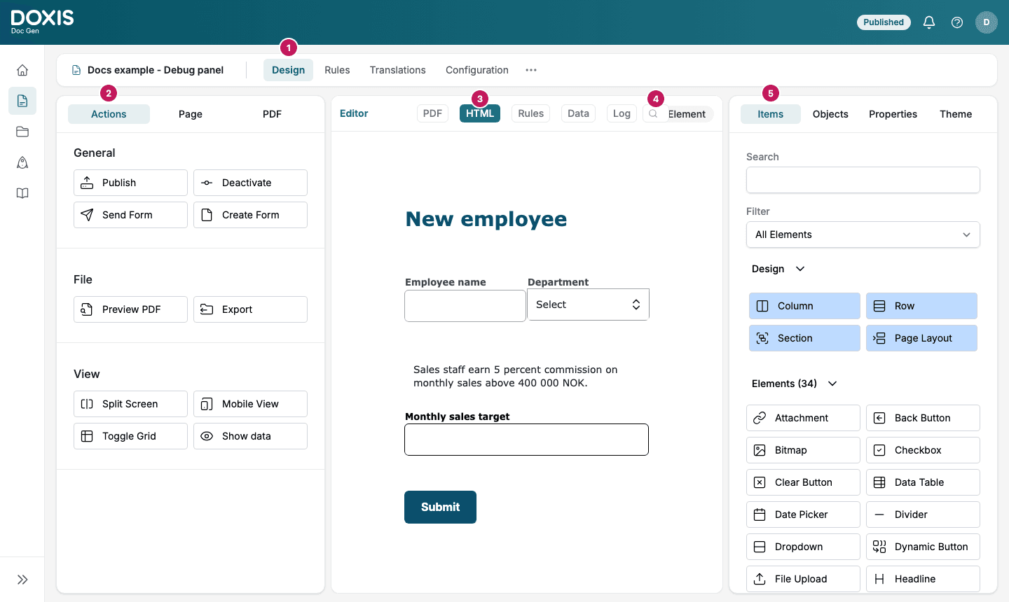
- Form bar. The name of the Smartform and its tabs: Design, Rules, Translations and Configuration, and More options for the other tabs. This is where you control how you work with the Smartform. See Studio workspace. The menu on the left of Studio collapses to icons while you are in a Smartform, so the editor gets the full width.
- Left panel (Action / Page / PDF). Manage Smartform settings and publishing.
- Editor. Build your form layout and content. You see your Smartform and all the changes you make in real time. The tabs in the header of the editor are the views of the Smartform:
- PDF, HTML, Rules and Data show the Smartform in different ways. You can show two of them side by side with Split Screen.
- Warnings is shown only when Studio has found a problem in the design. See Warnings.
- Log lists the changes made to the Smartform. See Log.
- Property search. The search field in the header of the HTML view takes you to a section, row or element by name. See Search and shortcuts.
- Right panel (Items / Objects / Properties / Theme). Add elements and configure their behavior.
Find an item in the Items tab
The Items tab has two ways to narrow down the list of elements:
- Search finds an element by name.
- Filter shows one kind of element: All Elements, Static Elements, Dynamic Elements, Media Elements or Action Button Elements.
The Design group at the top holds the parts of the layout: Column, Row, Section and, where it is available, Page Layout.
📝 Note: While you work, Studio also tells you when somebody else has the same Smartform open. See Editing together.
Layout structure
Smartforms are built using a structured layout:
| Element | Description |
|---|---|
| Page | The main container of the Smartform |
| Section | Groups content into logical parts |
| Row | Defines horizontal layout inside a section |
| Column | Splits rows into vertical areas |
| Element | Content such as text, inputs, or images |
This structure helps you create flexible and consistent layouts.
💡 Tip:
Think of the layout like building blocks. Start with sections, then add rows and columns, and finally place your elements.
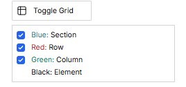
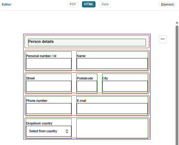
To better understand the structure, you can enable Toggle Grid in the left toolbar. This will display the layout grid and help you see how sections, rows, and columns are organized.
How Smartforms are typically built
Most Smartforms follow this general process:
- Structure the layout using sections, rows, and columns
- Add elements such as inputs, text, or images
- Configure properties and behavior
- Preview and test the form
- Publish and activate
💡 Detailed steps are explained in the sections below.
Design tabs
Within the Design view, you can configure different parts of your Smartform:
- Action: Publish, activate, and manage the Smartform
- Page: Configure general Smartform settings
- PDF: Control how the Smartform is exported as a PDF
- Items: Add elements to your form
- Objects: Manage reusable data objects
- Properties: Configure behavior and styling
- Theme: Apply styling and themes
Other pages in this section:
- Section properties: Settings of a whole section, such as the link to an object and what is left out of the PDF
- Split Screen: Work with two views side by side
- Search and shortcuts: Find an item by name and use keyboard shortcuts
- Warnings: Problems that Studio finds in your design
- Log: Changes made to the Smartform
- Test your Smartform: Open the Smartform and find out why it behaves as it does