Filling in a Smartform
This page describes what a person sees while they fill in a Smartform, and which settings in SmartForms Studio cause it: when a required field is marked, what the error messages say, how Next and Back work in a step by step form, how dates and e-mail addresses are checked, and how repeated rows behave. The pictures use a travel request form with three sections: Traveller, Accommodation and Expenses.
For files that are added to a form, see Uploading files in a Smartform. For a form that does not open at all, see When a form or page does not open.
Changes are saved while the person fills in the form. The label at the top left shows …Saving and then Saved.
Required fields
A field is required when Required field is ticked in its properties in Studio. A required field shows an asterisk after its label.
A new form shows no errors. A required field is flagged in three cases:
- The person clicks in the field and leaves it without a value.
- The person clicks Next and the field is in the section they are leaving.
- The person clicks Submit and the field is anywhere in the form.
When a field is flagged, its asterisk turns red, its box gets a red border, and Is Required shows under it. You can change that text with Custom required error message in the field’s properties.
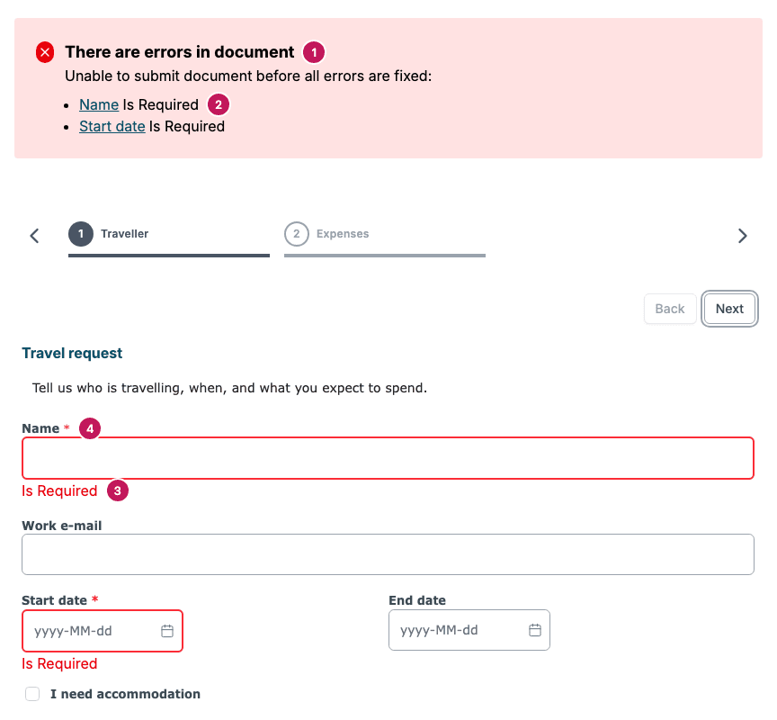
- There are errors in document, the heading of the error box. It also says Unable to submit document before all errors are fixed.
- The field name and its message. The name is a link: it moves the person to the field and, in a step by step form, opens the step that holds it.
- The message under the field.
- The asterisk of a flagged field, now red.
The error box lists the fields that have an error right now. When the person fixes a field, its line disappears from the box. A field with a value that is not allowed, such as a badly written e-mail address, is listed in the box straight away.
If Next or Submit is blocked, a short message also shows in the top right corner: Required fields are missing values when a required field is empty, or Text field has a invalid format when the only problem is a value that is not allowed.
The heading of the error box follows the language the form is shown in. The short message in the top right corner is always in English.
Hidden fields never block
A required field that is hidden does not stop Next or Submit. This covers a field hidden by a Show/Hide rule and every field in a section that a rule hides. In the travel request form, Hotel name is required, but it sits in the Accommodation section, which is shown only when the person ticks I need accommodation. A person who does not need a hotel submits the form without ever seeing that field.
Step by step forms
Choose the form type on the Theme menu in Studio. The options are Normal, Step by step and Standard w/Table. See Theme. In a step by step form every section is one step, and the step names show at the top.
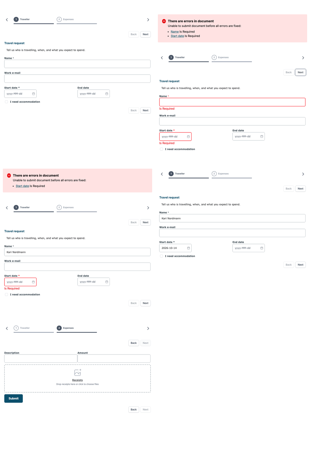
- Next checks the required fields of the section the person is in, and only that section. If something is missing, the person stays on the step and the error box lists what to fix. If everything is filled in, the next step opens.
- Back goes to the previous step without checking anything.
- Submit checks every visible section. The error box then lists every missing field, and each entry opens the right step.
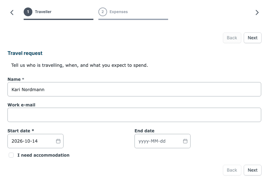
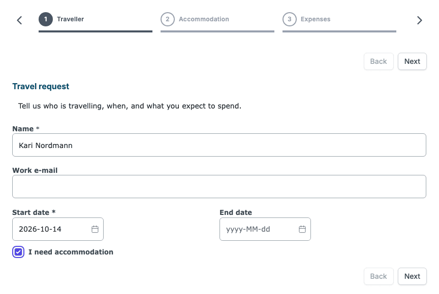
A section with no visible field is skipped. It does not count as a step and it does not show in the list of steps at the top. When the person ticks I need accommodation, the Accommodation section appears as step 2.
E-mail addresses
To check an e-mail address, add an Input line and choose Email under Validate data in its properties. You can write your own text in Custom validation error message.
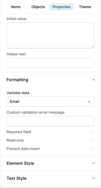
An address is accepted when it follows these rules:
- It has at most 80 characters and no spaces.
- It has exactly one @ with text on both sides.
- The part before the @ does not start with a dot.
- In the part after the @, the parts between dots are 1 to 63 letters, digits or hyphens, none starts or ends with a hyphen, and there are no two dots in a row.
If the address is not accepted, the error box lists the field with Only email, or with your own text.
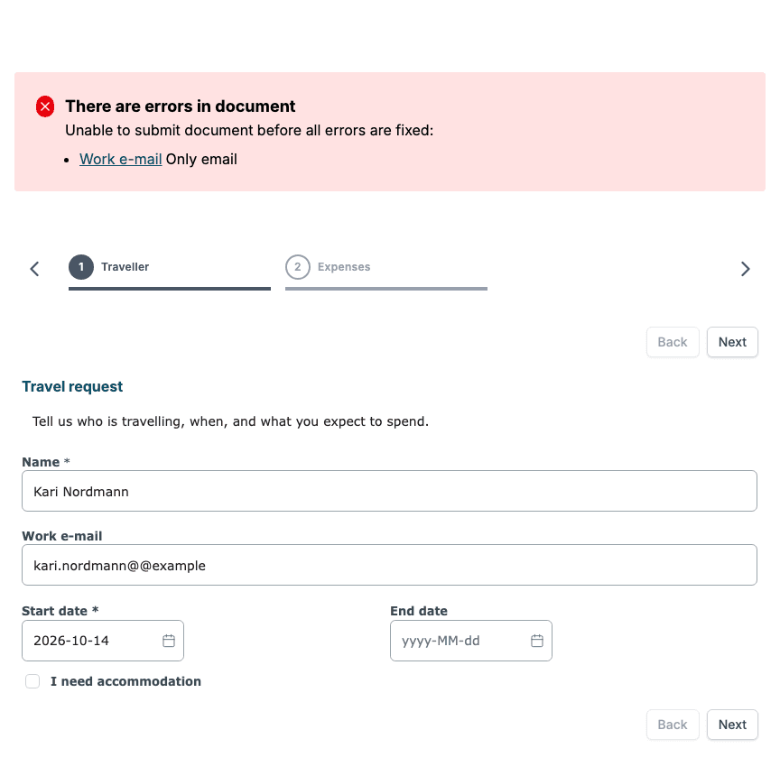
An empty e-mail field is fine unless the field is also required. The same check runs again on the server when the form is submitted, so a value sent through the API must follow the same rules.
Other options under Validate data on an Input line are None, Text, Number, SSN, Api, Integer and BBAN. Some show more settings:
| Validate data | Extra settings |
|---|---|
| Text | Max number of characters, Min number of characters |
| Number, Integer | Max value, Min value |
| SSN | Country: Norway, Sweden, Finland or Denmark |
Dates
A Date Picker can limit which dates the person can choose.
- Select the Date Picker in the Smartform and open Properties.
- Open Formatting.
- Under Min date or Max date, pick a fixed date, or click Use expression to write one. Click Use static date to go back to picking a date.
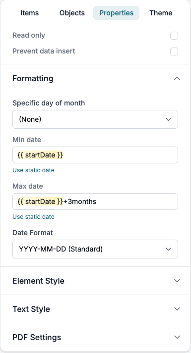
An expression can be written in these forms:
| Write | Meaning |
|---|---|
today | Today |
today+3months | Three months from today |
today-2days | Two days ago |
{{ startDate }} | The date the person chose in the Date Picker with the property startDate |
{{ startDate }}+3months | Three months after that date |
The unit can be days, months or years, and the singular form works too. To point at another Date Picker, write its Property name inside double curly braces.
What the person sees:
- Days outside the limits are grey and cannot be chosen.
- A date that is typed outside the limits is changed to the nearest allowed date.
- While the date a limit points to is still empty, that limit does not apply.
When a form is created with values through the API, a date outside the limits is left empty.
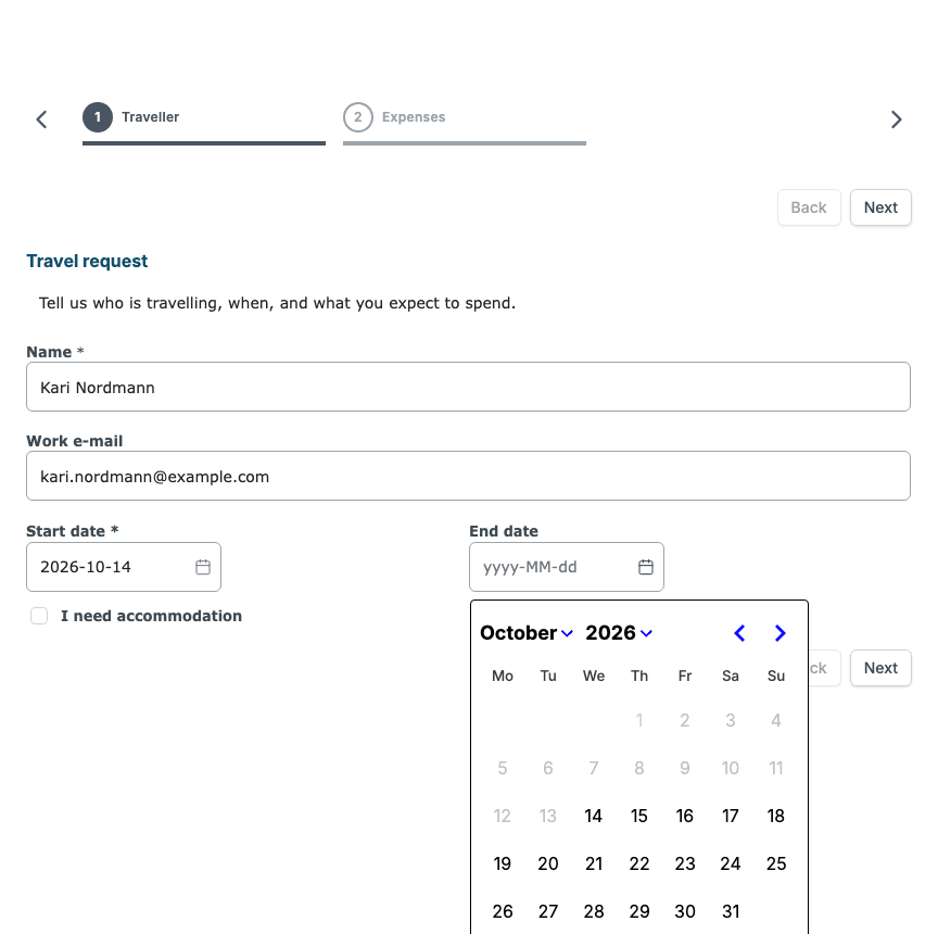
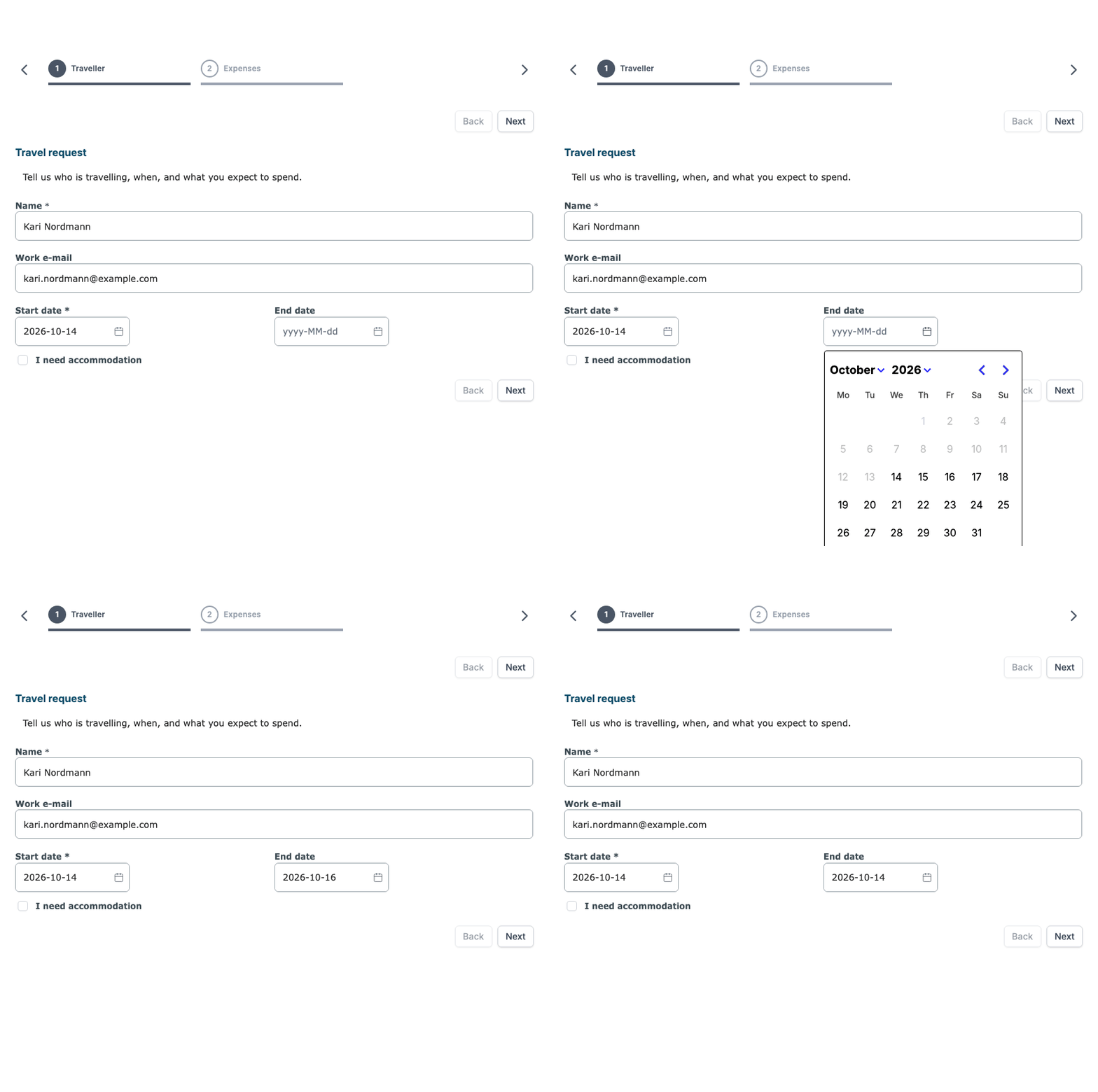
Two more settings sit in the same group:
- Specific day of month limits the choice to one day each month: 1 to 28, or 29 or last, 30 or last, 31 or last. The last option means that day, or the last day of the month in a shorter month.
- Date Format sets how the date is written: YYYY-MM-DD (Standard), DD-MM-YYYY (Standard Inverted) or MM-DD-YYYY (US).
Repeated rows
A row can repeat, so that the person adds as many lines as they need, for example one line for each expense. In Studio, select the row and open Repeating Row:
| Setting | What it does |
|---|---|
| Enable Row Repeat | Turns repeating on for the row. |
| Variable Name | Names the data that pre-fills the rows when a form is created from data. |
| All fields must be filled to add a new row | A new row appears only when every field in the last row has a value. |
| Enable Edit | Adds the row controls described below. |
| Hide empty rows on PDF | Leaves rows without values out of the PDF. |
When the person starts filling in a row, a new empty row appears under it. With Enable Edit, each row gets small controls under it:
- Move up and Move down change the order of the rows.
- Insert row adds an empty row after it.
- Delete row removes the row. The first row has no delete button.
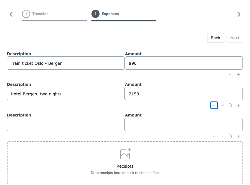
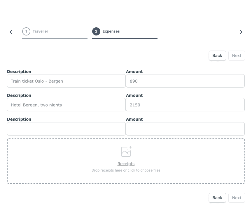
The controls are not shown once the answers are locked: after the form is submitted or aborted, while it is being submitted, on a PDF, and, in a multi-step process, for sections outside the person’s own step.
Submit or distribute
The Submit button in the form completes it. When the Smartform has a toolbar with the send button, the button at the end of the toolbar also sends the form: it is named Submit, or Distribute document when the Smartform has a Distribution List. See Using the Doc Composer. If the Distribution List template of a form has been removed, the form still opens and the toolbar button is named Submit.
Messages the person can see
| Message | When | Where it comes from |
|---|---|---|
| Is Required | A required field has no value. | The Required field setting. Change the text with Custom required error message. |
| Only email | The value in an Email field is not an e-mail address. | The Validate data setting. Change the text with Custom validation error message. |
| There are errors in document | Next or Submit found a missing value, or a value is not allowed. | Shown at the top of the form. |
| Required fields are missing values | Next or Submit was blocked by an empty required field. | A short message in the top right corner. |
| Text field has a invalid format | Next or Submit was blocked by a value that is not allowed. | A short message in the top right corner. |
| File size for all files needs to be less than N MB | The files on a File Upload are too large. | See Uploading files in a Smartform. |
| File type not accepted. Types accepted are: | The file type is not allowed. | See Uploading files in a Smartform. |